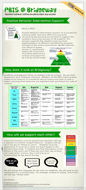
 Like others have stated, I had a hard time getting started...deciding which tool to use, exactly what information to include, etc. In the end, I used Piktochart. It was a new tool for me and I liked how quick I was able to teach myself how to use it. I chose to complete my infographic on my school's beginning journey into PBIS. I am part of the coaching team and I thought this would be a nice visual to add to our school website. We are in the VERY beginning stages of implementing PBIS in our school. There are so many components to PBIS, so I decided to summarize where we are so far. As we learn more and add other components, I would like to create more infographics to document our journey. The team is getting ready to write lesson plans for two parts of our matrix. I think when those plans are written, an infographic would be a new way to present the information to the staff.
Sunday, October 7, 2012
PBIS @ Bridgeway
 Like others have stated, I had a hard time getting started...deciding which tool to use, exactly what information to include, etc. In the end, I used Piktochart. It was a new tool for me and I liked how quick I was able to teach myself how to use it. I chose to complete my infographic on my school's beginning journey into PBIS. I am part of the coaching team and I thought this would be a nice visual to add to our school website. We are in the VERY beginning stages of implementing PBIS in our school. There are so many components to PBIS, so I decided to summarize where we are so far. As we learn more and add other components, I would like to create more infographics to document our journey. The team is getting ready to write lesson plans for two parts of our matrix. I think when those plans are written, an infographic would be a new way to present the information to the staff.
Subscribe to:
Post Comments (Atom)

I like the idea of creating something you can use. This will go nicely with your digital story! It is still a bit text heavy though. Is there a way to convert some of the text to a picture or a chart that would rely less on text? For example, perhaps show a picture of a bus, the cafeteria, and the hallway instead of just using the word. Good luck on your journey with PBIS!
ReplyDeleteI bet the other members on your PBIS team are really impressed! It looks great, and will be a great tool to share with others in your school. We are several years into PBIS and it has made a big difference in our school and our students. Good luck!
ReplyDelete